

Landing Page Design Strategies That Increase Lead Generation
- July 13, 2026
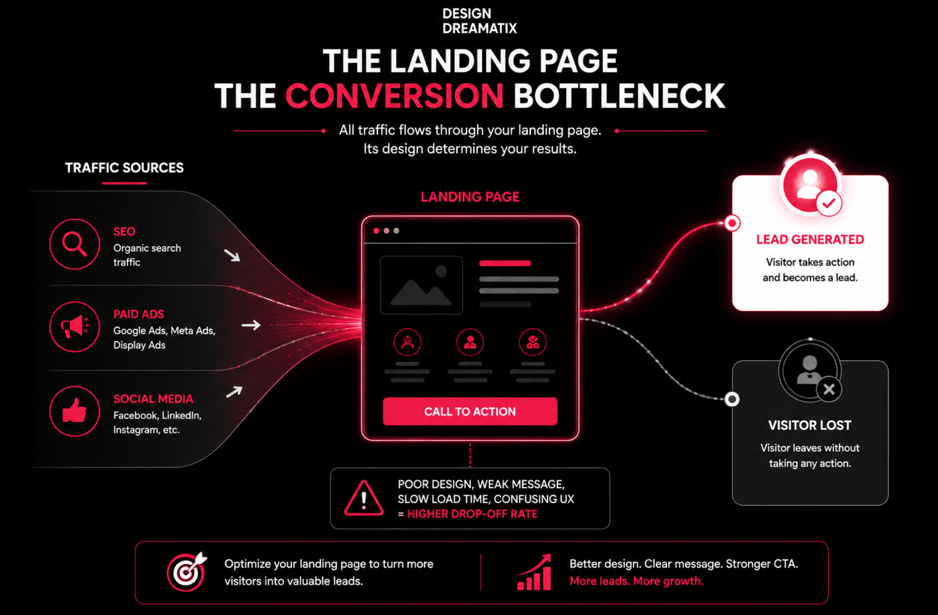
Driving traffic to your website is only half the battle. You can rank on page one, run flawless ad campaigns, and still watch your lead numbers stall because the page people land on isn’t built to convert them.
This is one of the most expensive blind spots in modern marketing. Businesses pour budget into SEO, paid media, and social campaigns, then send that hard-won traffic to a page that was designed to look nice rather than perform.
A landing page is not a digital brochure. It’s a conversion engine a single-purpose tool built around one job: turning a visitor’s attention into a lead, a demo request, or a sale.
In this guide, we’ll break down why landing pages matter more than most businesses realise, the psychology that drives high-converting design, ten strategies you can apply immediately, the mistakes quietly killing your conversion rate, and how to measure whether your page is actually working. If you’re a founder, marketer, or business owner trying to get more out of the traffic you already have, this is where to start.
Why Landing Pages Matter for Lead Generation
A Landing Page Is Not a Homepage
Your homepage has to serve everyone investors, job seekers, existing customers, curious browsers. It’s a hub with dozens of exits.
A landing page has one visitor persona, one message, and one goal. Every headline, image, and button exists to move that specific visitor toward that specific action. That singular focus is precisely what makes landing pages convert at a much higher rate than general website pages there’s nowhere else to look, and nothing else to do.
Focus Removes Friction
Every extra menu item, unrelated link, or competing message on a page gives visitors a reason to leave before converting. A well-built landing page strips this away. There’s no main navigation pulling attention elsewhere, no unrelated content competing for clicks just a clear path from problem to solution to action.
This is where user experience (UX) becomes a business function, not just a design preference. Good UX guides attention. Poor UX scatters it.
Customer Intent Decides Everything
Someone who clicks a Google ad for “affordable CRM software for small teams” already has a problem and a rough idea of the solution. If your landing page doesn’t immediately confirm they’re in the right place, they bounce and that ad spend is gone.
Landing pages exist to match intent instantly. The stronger that match, the lower your cost per lead and the higher your return on every marketing channel feeding that page.
The Ripple Effect on Paid and Organic Growth
A high-converting landing page doesn’t just generate more leads it makes every other marketing effort more efficient:
- Paid campaigns get a better Quality Score and lower cost-per-click when landing pages are relevant and fast.
- SEO traffic converts at a higher rate, improving the ROI of content and link-building efforts.
- Sales teams receive better-qualified leads because the page pre-sells and filters before the conversation even starts.
In short: landing pages aren’t a small piece of your funnel. They’re the multiplier that determines whether the rest of your marketing budget performs or gets wasted.
The Psychology Behind High-Converting Landing Pages
Design decisions aren’t just aesthetic they’re psychological triggers that either build momentum toward action or quietly talk visitors out of it.
First Impressions Are Formed in Seconds
Visitors form an opinion about credibility and relevance almost instantly. If your hero section looks dated, generic, or unclear, trust drops before a single word is read. This is why the top of the page the hero section carries disproportionate weight in conversion outcomes.
Visual Hierarchy Directs the Eye
Not every element on a page deserves equal attention. Strong visual hierarchy size, colour, spacing, and contrast — tells the eye where to look first, second, and third. Without it, visitors have to work to figure out what matters, and most won’t bother.
Cognitive Load Kills Conversions
Every additional decision, form field, or paragraph adds mental effort. The brain naturally avoids effort where it can, which means a page that feels “heavy” to process loses visitors before they ever reach the CTA. Simplicity isn’t a stylistic choice it’s a conversion strategy.
Trust Signals Reduce Risk
Visitors are constantly (often unconsciously) asking, “Can I trust this?” Testimonials, client logos, certifications, and transparent contact details all lower perceived risk, which is often the final barrier before someone submits a form.
Social Proof Validates the Decision
Humans look to others before acting, especially when the outcome is uncertain. Reviews, case studies, and numbers (“500+ businesses served”) reassure visitors that people like them have already made this choice successfully.
Urgency Prompts Action
Left unprompted, most visitors will “come back later” and never do. Genuine urgency (limited slots, time-bound offers, seasonal relevance) nudges hesitant visitors to act now rather than postpone indefinitely.
Clarity Beats Cleverness
Clever copy that requires interpretation slows visitors down. Clear copy that states the benefit plainly moves them forward. On a landing page, clarity should always outrank creativity.
Emotional Triggers Drive the First Click
People rarely act on logic alone. Fear of missing out, desire for status, relief from a pain point, or aspiration for growth these emotional undercurrents are what get the cursor moving toward the CTA. Logic then justifies the decision after the emotional trigger has already done its job.
Landing Page Design Strategies That Increase Lead Generation
Strategy 1 Write a Clear, Benefit-Driven Headline
Why it matters: Your headline is read by 100% of visitors most of the rest of the page is not. If the headline doesn’t communicate value in seconds, everything below it goes unread.
Common mistakes: Vague taglines, internal jargon, or headlines that describe the product instead of the outcome it delivers.
Business impact: A weak headline increases bounce rate immediately, before your value proposition, offer, or trust signals ever get a chance to work.
UX best practice: Lead with the benefit, not the feature. Speak to the visitor’s problem, not your product’s specification sheet.
Practical example: Instead of “Cloud-Based Inventory Management Software,” try “Never Run Out of Stock Again Automated Inventory for Growing Retailers.”
Strategy 2 Create a Strong Value Proposition
Why it matters: The value proposition answers the visitor’s unspoken question: “Why should I choose this over anything else?”
Common mistakes: Listing features without connecting them to outcomes, or trying to appeal to everyone with generic claims like “the best solution for your business.”
Business impact: A sharp value proposition shortens the decision-making process, which is critical for both B2B landing pages (longer consideration cycles) and B2C pages (impulse-driven decisions).
UX best practice: Pair your value proposition with a supporting subheadline that adds specificity numbers, timeframes, or a clear differentiator.
Practical example: A SaaS landing page for project management software might use: “Plan Projects in Minutes, Not Meetings Built for Teams of 5 to 500.”
Strategy 3 Use a Single, Focused Call-to-Action (CTA)
Why it matters: Every additional CTA on a page dilutes attention and forces visitors to make a decision they didn’t come to make: which button to click.
Common mistakes: Multiple competing CTAs (“Sign Up,” “Learn More,” “Contact Us,” “Download Now”) scattered across the same page.
Business impact: Fewer choices lead to higher completion rates. This is one of the most well-documented principles in conversion rate optimization.
UX best practice: Choose one primary action for the entire page, and repeat that same CTA (in wording and design) at multiple scroll points.
Practical example: A landing page promoting a free trial should say “Start Your Free Trial” everywhere not “Get Started” in the hero and “Try It Now” further down.
Strategy 4 Build Trust with Testimonials, Reviews, and Social Proof
Why it matters: Visitors trust other customers more than they trust your marketing copy.
Common mistakes: Vague, unattributed quotes (“Great service!” Anonymous) that read as fabricated, or no social proof at all.
Business impact: Genuine social proof directly reduces the perceived risk of converting, particularly for higher-ticket B2B services or SaaS subscriptions.
UX best practice: Use specific, outcome-focused testimonials with a real name, title, and company where possible. Client logos and third-party review scores add further credibility.
Practical example: “We cut our lead response time by half within the first month” carries more weight than “Amazing team, highly recommend.”
Strategy 5 Simplify Forms to Reduce Friction
Why it matters: Every additional form field is a small decision point where a visitor can hesitate, get distracted, or abandon the page entirely.
Common mistakes: Asking for information that isn’t needed yet job title, company size, budget before the visitor has even decided to engage.
Business impact: Shorter forms consistently produce more submissions. The trade-off is lead quality versus lead quantity, and that balance should be a deliberate business decision, not an accident of over-asking.
UX best practice: Only request what you need for the very next step. Use multi-step forms for longer processes, so the form never feels overwhelming at first glance.
Practical example: A newsletter signup needs only an email address. A demo request might reasonably need name, email, and company nothing more.
Strategy 6 Design for Mobile-First Experiences
Why it matters: A large share of landing page traffic especially from paid social and search ads arrives on mobile devices first.
Common mistakes: Designing for desktop and shrinking the layout down afterward, resulting in tiny tap targets, cramped forms, and slow-loading images.
Business impact: A page that’s difficult to use on mobile loses leads regardless of how strong the offer or copy is.
UX best practice: Design the mobile layout first, then scale up. Prioritise thumb-friendly buttons, minimal typing, and content that reads well in short vertical blocks.
Practical example: Reduce a five-field desktop form to three essential fields on mobile, and consider click-to-call as an alternative CTA for mobile visitors.
Strategy 7 Guide Users with Strong Visual Hierarchy
Why it matters: Visual hierarchy tells visitors where to look, in what order, without them having to think about it.
Common mistakes: Equal visual weight given to every element, forcing visitors to scan the entire page just to find what matters.
Business impact: Clear hierarchy shortens the path to the CTA, which directly improves conversion speed and reduces drop-off.
UX best practice: Use size, colour contrast, whitespace, and positioning to create a deliberate reading path headline, supporting value, proof, action.
Practical example: A high-contrast CTA button surrounded by generous whitespace will consistently outperform a button that blends into a busy, cluttered section.
Strategy 8 Improve Page Speed and Performance
Why it matters: Visitors decide within moments whether a slow-loading page is worth waiting for and most won’t wait.
Common mistakes: Oversized images, unnecessary animations, and bloated code left over from page builder templates.
Business impact: Slow pages increase bounce rate and directly waste paid ad spend, since visitors leave before the page and your offer ever fully loads.
UX best practice: Compress images, minimise third-party scripts, and prioritise loading the content visitors see first (above the fold).
Practical example: Swapping oversized hero images for optimised, properly-sized formats can noticeably improve load times without any visible quality loss.
Strategy 9 Use High-Quality Visuals That Support the Message
Why it matters: Visuals aren’t decoration they either reinforce your message or distract from it.
Common mistakes: Generic stock photography that feels disconnected from the actual product, audience, or brand tone.
Business impact: Authentic, relevant visuals build trust and help visitors picture themselves using the product or service, which strengthens buying intent.
UX best practice: Use product screenshots, real team photos, or custom illustrations that reflect your actual brand and offer not borrowed imagery that could belong to any company.
Practical example: A SaaS landing page showing an actual dashboard screenshot builds more credibility than an abstract illustration of “people pointing at a laptop.”
Strategy 10 Test, Measure, and Continuously Optimise
Why it matters: Even well-designed landing pages are hypotheses. Real visitor behaviour not internal opinion should decide what stays and what changes.
Common mistakes: Publishing a landing page and never revisiting it, or making multiple changes at once so it’s impossible to know what actually moved the needle.
Business impact: Continuous optimisation compounds over time small, consistent improvements to conversion rate translate directly into a lower cost per lead across every channel.
UX best practice: Run structured A/B tests on one variable at a time headline, CTA wording, form length and let the data decide.
Practical example: Testing two headline variations for a month might reveal a measurable lift in submissions with no other changes to the page.
Common Landing Page Mistakes That Kill Conversions
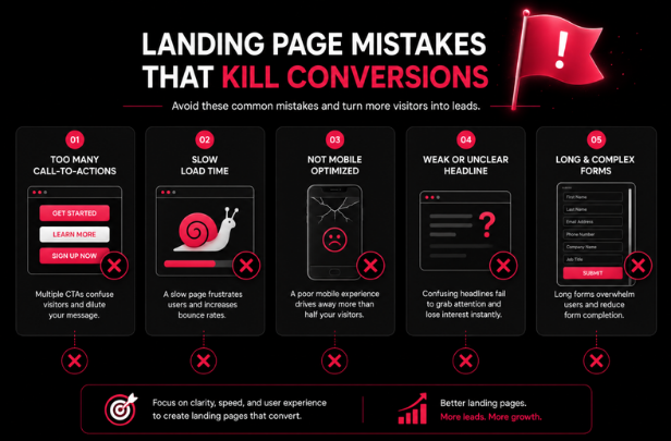
- Too many CTAs: Splits attention and forces an unnecessary decision at the exact moment you want a single action.
- Weak messaging: Vague or feature-heavy copy fails to answer “what’s in it for me?” fast enough.
- Slow loading speed: Every extra second of load time gives visitors another reason to abandon the page.
- Generic stock images: Erodes authenticity and makes the brand feel interchangeable with competitors.
- Long forms: Each unnecessary field adds friction and increases abandonment before submission.
- Poor mobile responsiveness: Alienates the growing share of visitors browsing and converting from their phones.
- Inconsistent branding: Undermines trust by making the page feel disconnected from the ad or email that brought the visitor there.
- Lack of trust signals: Leaves visitors without the reassurance they need to take a risk on an unfamiliar business.
- Confusing navigation: A full menu bar on a landing page gives visitors an easy way to leave before converting.
Each of these mistakes seems small in isolation. Together, they compound and the result is a page that generates traffic without generating leads.
Essential Elements of a High-Converting Landing Page
Every section of a well-built landing page earns its place by serving a specific strategic purpose:
- Hero section: The first and sometimes only impression. Sets tone, relevance, and credibility instantly.
- Headline: Communicates the core benefit before the visitor decides whether to keep scrolling.
- Supporting copy: Expands on the headline with just enough context to build interest, without overwhelming.
- Benefits: Answers “what do I get?” in outcome-focused language, not feature lists.
- Features: Provides the “how” for visitors who want more detail, positioned after benefits, not before.
- CTA: The single, unmistakable next step repeated, consistent, and visually prominent.
- Lead capture form: The mechanism that turns interest into a measurable lead kept as short as the goal allows.
- Social proof: Testimonials, logos, and reviews that reduce perceived risk at key decision points.
- FAQs: Removes lingering objections that would otherwise stop a visitor from converting.
- Trust badges: Certifications, security seals, or partner logos that reinforce legitimacy, especially for unfamiliar brands.
- Contact information: A visible, easy-to-find way to reach a real business, which quietly reassures hesitant visitors.
None of these elements exist for decoration. Each one is doing a specific job in moving a stranger toward becoming a lead.
How Design Dreamatix Designs Landing Pages That Convert
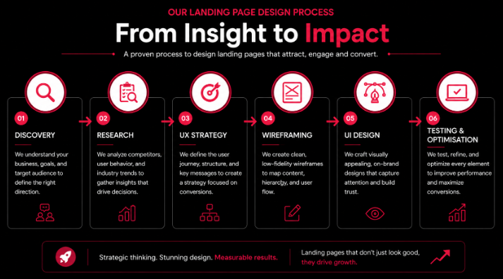
At Design Dreamatix, we don’t treat landing pages as a design deliverable we treat them as a business tool built to earn its keep.
Business discovery. Before a single wireframe is sketched, we get clear on your goals, offer, and what a “qualified lead” actually looks like for your business. A landing page for a SaaS free trial and one for a high-ticket B2B service need very different strategies.
Audience research. We look at who’s actually landing on the page their intent, their objections, and the language that resonates with them so the messaging speaks directly to real buyers, not assumptions.
UX strategy. Every layout decision is mapped to a conversion goal first. Structure, flow, and hierarchy are planned before visuals are considered.
Wireframing. We build the skeleton of the page content order, CTA placement, form position and validate the logic of the journey before investing in visual design.
UI design. Once the structure is proven, we apply visual identity, imagery, and interaction design that reflects your brand while reinforcing the conversion path already established.
Conversion-focused copy collaboration. Design and messaging are developed together, not in isolation, so visuals support the copy instead of competing with it.
Responsive development. Every page is built to perform identically well across devices, with mobile experience treated as a first-class requirement, not an afterthought.
User testing. Before launch, we test real user behaviour against the intended journey to catch friction points early.
Continuous optimisation. Launch isn’t the finish line. We monitor performance and refine based on real data, because the highest-converting landing pages are the ones that keep improving after they go live.
This is the same strategic-first approach behind our broader website design and development work landing pages are simply the most focused, highest-stakes expression of it.
Measuring Landing Page Success
A landing page’s design isn’t finished at launch it’s finished when the data says it’s working. These are the metrics that matter most:
- Conversion Rate: The percentage of visitors who complete your desired action. The single most direct measure of landing page performance.
- Bounce Rate: How many visitors leave without interacting further. A high bounce rate often signals a mismatch between ad messaging and page content.
- Time on Page: Indicates whether visitors are actually engaging with your content or leaving almost immediately.
- Scroll Depth: Shows how far visitors read before dropping off, which helps identify where attention and interest is being lost.
- Form Completion Rate: Highlights friction specifically within the lead capture process, separate from the rest of the page.
- Cost Per Lead (CPL): Connects landing page performance directly to marketing spend efficiency.
- Customer Acquisition Cost (CAC): Zooms out further, showing how landing page performance affects the true cost of winning a customer.
- A/B Testing Results: The most reliable way to know whether a specific design or copy change actually improved outcomes, rather than assuming it did.
Businesses that treat these metrics as a monthly habit not a one-time launch checklist consistently outperform competitors who redesign once and hope for the best.
Ready to See What Your Website Could Achieve?
High-converting landing pages are never accidental. They’re the result of deliberate strategy — a clear understanding of user psychology, disciplined UX decisions, and a genuine commitment to testing and improving over time.
If your business is investing in traffic but not seeing proportional results in leads, the landing page is very often where that value is being lost. The good news: it’s also one of the fastest, highest-leverage things to fix.
At Design Dreamatix, we help startups, SaaS companies, and growing businesses build landing pages that don’t just look polished — they perform. If you’re ready to turn more of your existing traffic into qualified leads, get in touch with our team or explore more of our thinking on our insights page. We’d love to learn about your business and show you what a strategy-first landing page could do for it.
Frequently Asked Questions
Some pre questions and answers
What makes a landing page convert?
A high-converting landing page combines a clear, benefit-driven message, a single focused call-to-action, strong trust signals, and a frictionless user experience all aligned to match the visitor's original intent.
How is a landing page different from a homepage?
A homepage serves multiple audiences and goals with several navigation paths. A landing page is built around one audience, one message, and one action, with distractions deliberately removed.
How many CTAs should a landing page have?
Ideally one primary call-to-action, repeated consistently throughout the page. Multiple competing CTAs dilute focus and reduce overall conversion rates.
What is the ideal landing page length?
There's no universal length it depends on the complexity of your offer. Simple, low-commitment offers can convert well with shorter pages, while higher-consideration purchases (like enterprise software) often need longer pages to build sufficient trust and address objections.
Why is UX important for landing pages?
UX determines how easily a visitor can understand your offer and take action. Even the best offer will underperform if the experience around it is confusing, slow, or frustrating to use.
How can I increase landing page conversions?
Start with clarity: sharpen your headline, simplify your form, strengthen your trust signals, and remove anything that doesn't directly support your one core action. Then test and refine based on real visitor data.
Should landing pages be SEO optimized?
Yes, landing pages built for organic traffic should target specific keywords, use clear heading structures, and load quickly, all without compromising the focused, conversion-first design that makes them effective.
How often should I test my landing pages?
Ongoing testing is best practice. Even small, incremental tests run consistently over time tend to outperform occasional, large redesigns.
What metrics should I track?
At minimum: conversion rate, bounce rate, form completion rate, and cost per lead. These four give a clear, business-relevant picture of landing page performance.
Is a professional landing page worth the investment?
For any business relying on paid ads, SEO, or campaigns to generate leads, yes. A professionally designed landing page typically pays for itself by improving the return on traffic you're already paying to acquire, turning existing marketing spend into more leads, without increasing the budget behind it.