
7 Signs Your Brand Identity Needs a Professional Redesign
More often than not, the missing piece isn’t the marketing. It’s the brand underneath it.
This is one of the most common blind spots in growing businesses. Leadership teams pour budget into campaigns, SEO, and social media, while the brand identity itself, the logo, the visual system, the tone, the overall impression hasn’t been touched in years. It’s easy to overlook, because a business rarely “notices” its own branding the way a new customer does. You’re too close to it.
So here’s the question worth sitting with: is your brand helping your business grow — or quietly holding it back?
An outdated or inconsistent brand identity doesn’t announce itself with a warning sign. It shows up in subtler ways — lower trust, weaker recall, and customers who choose a competitor because they simply “look more established.” Recognising when a brand identity redesign is genuinely needed, rather than a nice-to-have, is what separates businesses that scale confidently from those that keep wondering why growth has stalled.
This guide walks through exactly how to tell the difference, what a proper redesign actually involves, and what it means for a business’s long-term trajectory.
Why Brand Identity Matters More Than Ever
Brand identity used to be a background concern, something handled once, then left alone for a decade. That’s no longer viable. Customers now form an opinion about a business in seconds, often before they’ve read a single word of copy.
First impressions are formed almost instantly. Whether it’s a website, a product page, or a social profile, visual identity does the talking before your value proposition gets a chance to. Research from the Nielsen Norman Group shows that users consistently perceive visually polished designs as easier and more trustworthy to use — even when functionality is identical to a less polished version. .
Trust is built or lost visually. A polished, consistent identity signals that a business is stable and capable. An inconsistent one raises quiet doubts, even if the product itself is excellent.
Competitive positioning depends on perception, not just performance. Two companies can offer near-identical services, yet the one with sharper, more intentional branding is perceived as the premium option and often wins the sale.
Brand recognition compounds over time. Consistent visual identity, repeated across every touchpoint, is what allows a business to be remembered and referred to as the foundation of long-term brand recognition and organic growth.
Digital experiences are now the primary brand touchpoint. For most businesses, a website or app is the first real interaction a customer has with the brand long before a phone call or in-person meeting happens.
Long-term growth relies on brand equity, not just individual sales. A strong identity turns one-time buyers into repeat customers and repeat customers into referrals compounding value that outlasts any single marketing campaign.
Think of well-known examples: a food delivery brand that refreshed its identity to feel more premium saw customers perceive the service itself as higher quality even though the product hadn’t changed. That’s the power of identity: it doesn’t just represent the business, it actively shapes how the business is judged.
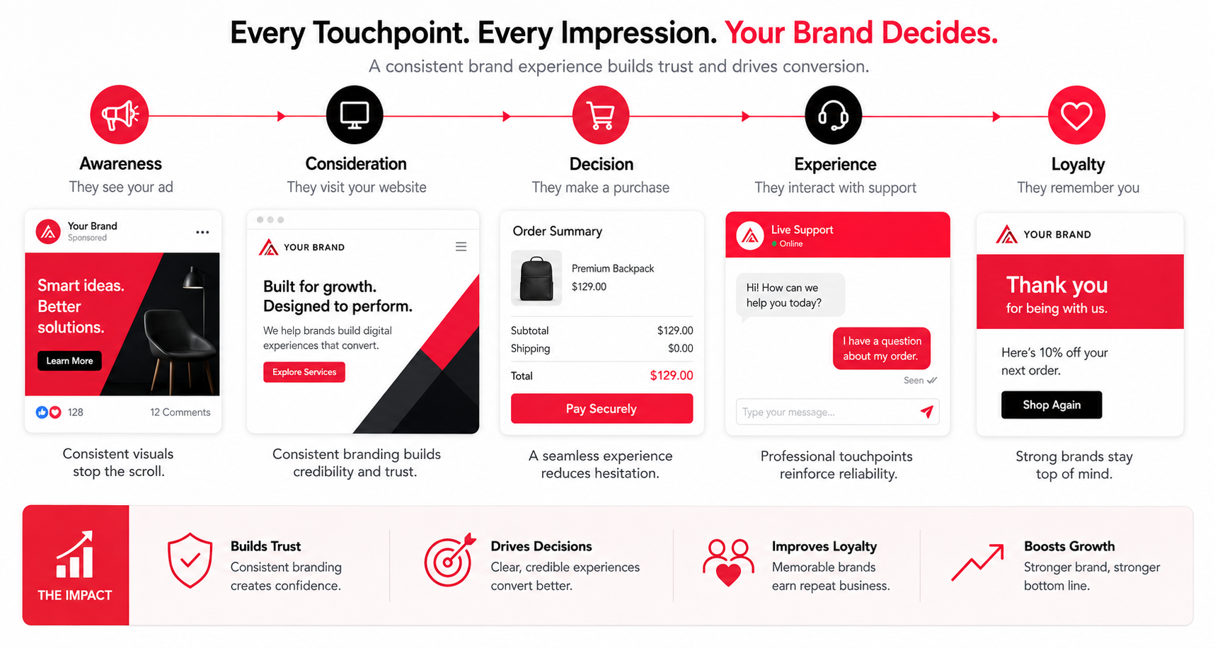
The 7 Signs Your Brand Identity Needs a Professional Redesign
Not every business needs a full rebrand. But certain signals are reliable indicators that your current identity is no longer serving your growth and may actively be working against it.
Your Logo Looks Outdated
The Problem: Design trends evolve, and a logo built five or ten years ago often carries visual cues, gradients, overly literal icons, dated fonts that instantly date a business, even if nothing else about it has changed.
Why It Hurts Business: An outdated logo creates a subconscious mismatch. Customers associate visual freshness with relevance; an old-looking mark can make even an innovative company appear behind the times.
Real-World Example: Several major tech and retail brands have quietly simplified their logos over the past decade flattening icons, adjusting typography, and removing unnecessary detail specifically to feel more current on digital screens and app icons.
Professional Solution: A logo redesign isn’t about chasing trends; it’s about distilling the mark into something timeless, scalable, and legible across every modern platform from a favicon to a billboard.
Your Brand Feels Inconsistent Across Platforms
The Problem: Different fonts on the website versus social media. Slightly different logo versions floating around. A tone of voice that’s formal in emails but casual on Instagram.
Why It Hurts Business: Inconsistency erodes trust before a customer even realises why. When a brand looks different everywhere, it subconsciously reads as unorganised and if a business can’t keep its own identity consistent, customers question whether it can deliver consistent service.
Real-World Example: A growing SaaS company might have a polished product UI, but a dated marketing website and mismatched social templates leaving prospects confused about whether they’re looking at the same company.
Professional Solution: Documented brand guidelines and a design system applied consistently across every platform website, app, social, sales decks, and email so the brand feels like one coherent experience everywhere it appears.
Your Website No Longer Reflects Your Business
The Problem: The business has grown, but the website still looks (and functions) like it did in an earlier, smaller stage: outdated layouts, poor mobile responsiveness, and messaging that no longer matches what the company actually offers.
Why It Hurts Business: For most prospects, the website is the business, at least initially. A slow, cluttered, or non-responsive site actively pushes potential customers toward competitors with smoother digital experiences.
Real-World Example: A B2B company that redesigned its site with a clearer UX and mobile-first layout often sees measurably longer session times and more demo requests not because the offering changed, but because the experience finally matched the quality of the service.
Professional Solution: A website redesign grounded in UX principles clear navigation, fast load times, mobile responsiveness, and visual consistency with the rest of the brand.
Customers Don't Remember Your Brand
The Problem: Prospects meet the business, seem interested, and then simply forget who you are within a week.
Why It Hurts Business: In crowded markets, differentiation is everything. A weak or generic visual identity stock color palettes, forgettable typography, a name-only logo with no distinct visual anchor makes a business blend into the background instead of standing out.
Real-World Example: Two competing local service businesses might offer nearly identical pricing and quality, but the one with a distinct color system and a memorable visual mark will consistently get more repeat referrals, simply because people can actually recall who they are.
Professional Solution: A stronger, more deliberate visual identity distinctive color systems, custom iconography, and a design language that’s genuinely different from competitors, not just a variation of them.
You've Outgrown Your Original Brand
The Problem: The identity was built for a much earlier version of the business a scrappy startup, a single service, a narrow audience and none of that reflects where the company is today.
Why It Hurts Business: A brand that hasn’t evolved alongside the business sends mixed signals: enterprise clients see a startup-looking identity and hesitate to trust it with bigger budgets; new markets see branding that clearly wasn’t built with them in mind.
Real-World Examples:
- A startup that has matured into an enterprise-grade provider but still carries an identity built for its scrappy early days
- A business that has expanded services well beyond its original offering, but whose branding still signals the narrower, original niche
- A company entering new audiences or geographic markets whose original visual identity and tone don’t translate
Professional Solution: A brand refresh or full brand redesign that repositions the identity to reflect current scale, offering, and ambition while retaining the recognisable elements that existing customers still trust.
Your Competitors Look More Modern Than You
The Problem: Side by side with competitors, your brand simply looks less current, less premium, or less considered.
Why It Hurts Business: Perception drives purchase decisions more than most business owners realise. When comparing similar offers, buyers often default to whichever brand feels more established and trustworthy regardless of actual product quality.
Real-World Example: In competitive industries like fintech or professional services, businesses with sharper, more modern branding are consistently perceived as more secure and capable even when the underlying offering is comparable to less polished competitors.
Professional Solution: A corporate branding and modern brand identity update that repositions the business visually in line with or ahead of where the market is heading, rather than reacting to where it’s already been.
Your Brand No Longer Reflects Your Values or Vision
The Problem: The business has shifted direction, new mission, new leadership, new positioning but the visual identity still represents an earlier version of the company’s purpose.
Why It Hurts Business: Businesses evolve constantly: priorities shift, sustainability becomes central, services become more specialised, culture matures. When branding doesn’t evolve alongside that, it creates a disconnect between what a business says it stands for and what it visually communicates.
Real-World Example: A company that pivots from a purely transactional service to a values-led, relationship-first model often finds its old, purely commercial-looking branding actively works against the new positioning.
Professional Solution: A strategic brand strategy refresh that realigns messaging, tone of voice, and visual identity with where the business and its leadership genuinely stands today.
Expert Tip: If your “About Us” page tells a different story than your logo and color palette suggest, your brand strategy and visual identity have drifted apart and it’s worth closing that gap intentionally.
Professional Redesign vs Simple Logo Redesign
One of the most persistent misconceptions in branding is that a logo redesign and a full brand identity redesign are the same thing. They’re not and confusing the two is exactly why some rebrands fail to move the needle on business growth. As the AIGA ,one of the design industry’s leading professional associations, puts it, branding is expressed through a graphic identity system but also includes the quality of the products, services, and relationships a business builds over time not a single visual asset.
A logo is a single visual asset. A brand identity is the entire system that determines how a business is experienced, everywhere it shows up. A genuine redesign typically covers:
- Brand Strategy – the positioning, mission, and differentiation that everything else is built on
- Brand Voice – how the business sounds in writing, from the website to customer support
- Color System – a structured palette, not just a “brand color,” built to work across every application
- Typography – font pairings selected for both personality and legibility across platforms
- Website – the digital experience that carries the identity into action
- UI – interface patterns for apps and products that reflect the same visual language
- Customer Experience – how the brand feels at every interaction point, not just how it looks
- Design System – a scalable library of components, patterns, and rules for consistent application
- Brand Guidelines – the reference document that keeps the entire identity consistent long after the project ends
A new logo alone rarely fixes the deeper issues covered in the seven signs above. It’s a visual patch on a structural problem. A genuine brand redesign rebuilds the system the logo lives inside which is why it delivers results a logo swap alone cannot.
Benefits of Investing in Professional Brand Identity Design
A well-executed redesign pays back in ways that extend well beyond aesthetics:
- Higher credibility – a polished, considered identity signals a business that takes itself seriously, which customers notice immediately
- Better customer trust – consistency and quality in design translate directly into perceived reliability
- Stronger first impressions – critical in industries where decisions are made within seconds of landing on a website or profile
- Premium positioning – a modern identity allows a business to compete on value rather than price alone
- Higher conversions – clearer messaging and a more intentional user experience tend to move more prospects to action
- Better employee confidence – teams sell and represent a brand more confidently when they’re proud of how it looks and feels
- Consistency – a documented system means every new hire, freelancer, or partner represents the brand correctly, every time
- A stronger digital presence – identity that’s built for web and app-first experiences performs better across every digital channel
What Happens During a Professional Brand Identity Redesign?
A credible rebrand follows a structured process not a designer opening software and guessing at colors. Here’s what a realistic engagement typically looks like:
- Discovery – understanding the business, its goals, its history, and where it wants to go
- Brand Audit – reviewing everything currently in use: logo, website, marketing materials, tone of voice
- Market Research – understanding the audience’s expectations, preferences, and perceptions
- Competitor Analysis – mapping how competitors position themselves visually and strategically
- Positioning – defining what makes the business genuinely different, and how that should be communicated
- Logo Exploration – developing and refining concepts based on the strategy, not aesthetics alone
- Visual Identity – building out the broader system: iconography, imagery style, layout principles
- Typography – selecting and pairing fonts that reflect the brand’s personality and work across mediums
- Color Palette – developing a structured, purposeful color system rather than a single “brand color”
- Brand Guidelines – documenting every rule so the identity stays consistent long-term
- Website Design – translating the new identity into a functioning digital experience
- Digital Assets – social templates, email signatures, presentation decks, and other applied materials
This sequence matters. Skipping strategy and jumping straight to visuals is exactly how businesses end up with a “new logo” that still doesn’t solve the underlying problem.
How Design Dreamatix Helps Businesses Transform Their Brand
Every business above the startup that’s outgrown its original look, the SaaS company whose product has matured faster than its marketing site, the established name that suddenly looks dated next to newer competitors is really facing the same underlying challenge: the identity and the business have drifted apart.
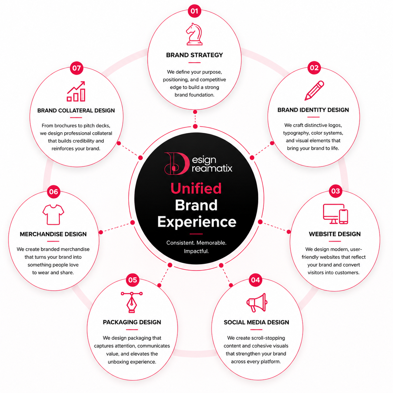
Closing that gap usually requires more than one discipline working together. Brand Identity Design establishes the strategic and visual foundation the logo, color system, typography, and voice that everything else is built on. From there, Website Design & Development carries that identity into the digital space where most first impressions now happen, while UI/UX Design and App UI/UX Design ensure the same clarity and consistency extend into products and applications, not just marketing pages.
For software businesses specifically, SaaS Product Design addresses the particular challenge of making complex products feel simple and trustworthy onboarding, dashboards, and feature discovery all shape how a SaaS brand is perceived just as much as its logo does. Landing Page Design then gives that identity a focused, conversion-oriented space to prove itself, whether the goal is a signup, a demo request, or a purchase. And Motion Graphic Design brings the brand to life in a format that’s increasingly central to how audiences engage short-form video, animated explainers, and product walkthroughs.
None of these disciplines work in isolation. A strong logo without a consistent website undermines itself. A beautiful website without clear UX loses the customers it attracts. The real value of a coordinated redesign is that every touchpoint visual, digital, and experiential reinforces the same story, rather than each one telling a slightly different version of the brand.
Conclusion
Across every one of the seven signs covered here an outdated logo, inconsistent platforms, a website that no longer fits, forgettable visuals, outgrown positioning, more modern-looking competitors, or a brand that no longer reflects your values the underlying message is the same: brands that grow intentionally, on purpose, tend to outperform brands that simply grow by accident.
None of this means chasing every design trend or rebranding for the sake of change. It means recognising, honestly, whether your current identity still represents the business you’ve become and whether it’s helping customers trust, remember, and choose you, or quietly working against all three.
Take a few minutes this week to look at your brand the way a new customer would your website, your social presence, your logo on a small screen. If something feels off, that instinct is usually right.
When you’re ready to explore what a professional brand identity redesign could look like for your business, Design Dreamatix is here for a strategic brand consultation no pressure, just an honest conversation about where your brand stands today and where it could go next.
Frequently Asked Questions
Some pre questions and answers
How do I know if my brand needs a redesign?
If your business has grown, pivoted, or expanded since your identity was last updated or if you recognise several of the seven signs above it's a strong indicator that a redesign is worth exploring.
How often should a brand identity be updated?
There's no fixed timeline, but most businesses benefit from a brand audit every 3–5 years, with a full redesign considered whenever the business itself has meaningfully changed.
Is a logo redesign enough?
Rarely. A logo is one visible piece of a much larger system strategy, voice, color, typography, and digital experience all need to align for a redesign to actually move the needle.
What is included in a professional brand identity?
A complete brand identity typically includes brand strategy, logo and visual system, typography, color palette, tone of voice, brand guidelines, and the digital application of all of these across web and product.
How long does a branding project take?
Depending on scope, a professional brand identity redesign typically takes 6–12 weeks, with additional time if a full website or product redesign is included.
Will a redesign affect customer trust?
When done strategically, a redesign builds trust by better reflecting the business's current quality and positioning. The key is retaining recognisable equity while modernising the parts that no longer serve the brand.
How much does professional branding typically cost?
Costs vary widely based on scope from a focused visual identity refresh to a full strategy-led rebrand with website and product design so most agencies scope pricing after an initial discovery conversation.
Can startups benefit from branding this early?
Yes — arguably more than established businesses. A clear, professional identity from day one helps startups compete for trust against larger, more established competitors from the outset.
What's the difference between a brand refresh and a full brand redesign?
A brand refresh updates and modernises existing elements while keeping core recognition intact; a full redesign rebuilds the strategy and visual system from the ground up, typically used when a business has fundamentally changed.
Should website redesign happen alongside a brand identity redesign?
Ideally, yes. Since the website is often the primary place customers experience a brand, redesigning identity without updating the website leaves a visible gap between the new brand and its most important touchpoint.