
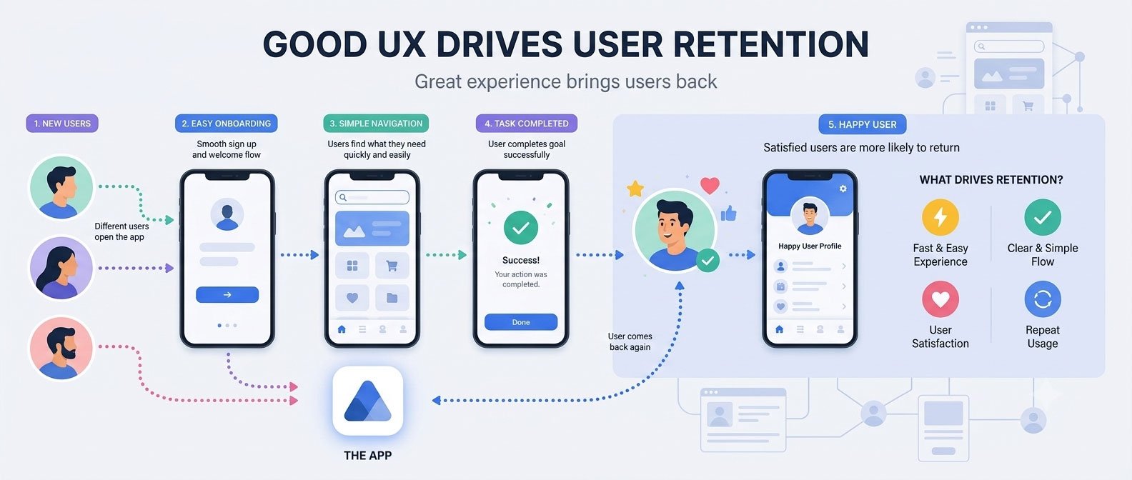
Our Approach to Mobile App UX That Drives Retention
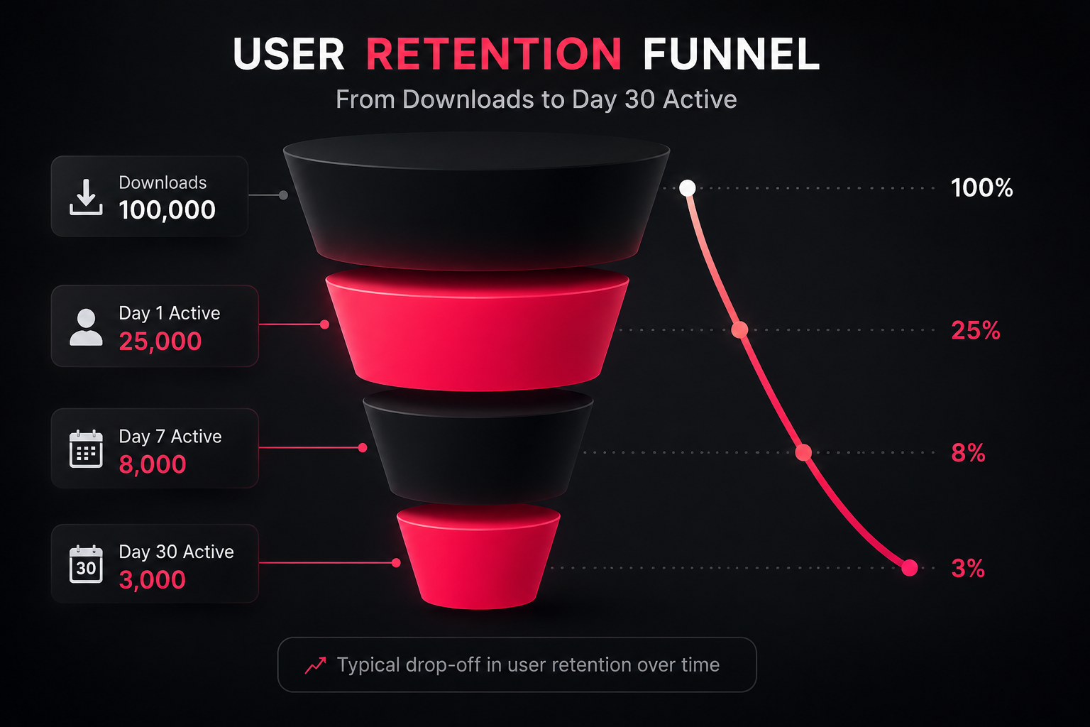
Every day, thousands of mobile apps are downloaded and most of them are opened once, maybe twice, and then quietly forgotten. Not deleted. Just abandoned, sitting on a home screen, never touched again.
That gap between “downloaded” and “actually used” is where most mobile products quietly fail. And it rarely comes down to the idea, the market, or even the budget behind it. More often, it comes down to the experience of using the thing.
This distinction matters because acquisition and retention are two entirely different problems. Getting someone to download an app is a marketing and distribution challenge. Getting them to come back tomorrow, next week, and next month is a design and product challenge and it’s the one most businesses underestimate.
Great mobile app UX isn’t about beautiful screens. It’s a business strategy. Every screen, interaction, and micro-decision either earns another visit or quietly pushes a user toward the “uninstall” button. Treated seriously, UX becomes one of the highest-leverage investments a product team can make because it directly determines whether the acquisition spend behind every install actually pays off.
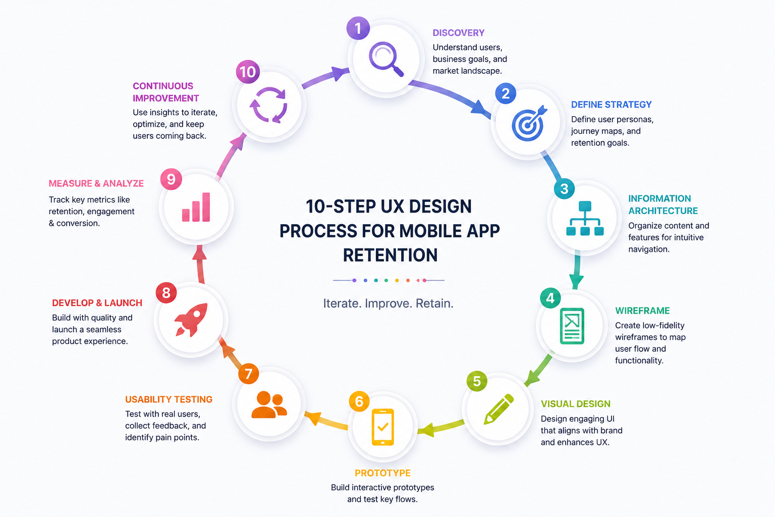
In this guide, we’ll walk through why retention deserves more attention than download numbers, the most common reasons users abandon apps, and the exact ten-step UX process we use at Design Dreamatix to build mobile products people genuinely keep coming back to.
Why User Retention Matters More Than Downloads
Download Numbers Can Be Misleading
A spike in downloads feels like success. It fills a dashboard, justifies an ad spend, and looks good in a founder update. But downloads measure curiosity, not value. A user tapping “install” has made almost no commitment they’ve simply agreed to try something for free.
The number that actually reflects product-market fit is what happens next: do they open the app again on day two? Day seven? Day thirty? That’s retention, and it’s a far more honest signal of whether the product is actually working. Independent UX research from the baymard.com consistently finds that the majority of mobile apps even from well-known brands underperform on core usability fundamentals, which helps explain why strong download numbers so often fail to translate into loyal, returning users.
The True Cost of User Churn
Every user who installs an app and leaves within the first week represents a wasted acquisition cost the ad spend, the app store optimization effort, the referral incentive all spent to acquire someone who never became a real user. Churn doesn’t just cap growth; it actively taxes every dollar spent on getting people in the door in the first place.
How Retention Impacts Revenue and Customer Lifetime Value
Retained users don’t just stick around, they spend more over time. In subscription and SaaS-style mobile products particularly, Customer Lifetime Value (CLV) compounds the longer a user stays active. A small improvement in retention rate can produce an outsized improvement in long-term revenue, because it changes the trajectory of every single cohort, not just the most recent one.
Retention Signals Reach Beyond the App Itself
- App Store ratings tend to improve naturally when users stay engaged long enough to see real value, rather than leaving frustrated reviews shortly after install.
- Brand loyalty builds through repeated positive interactions a user who trusts an app’s experience is far more likely to trust that brand’s other products.
- Word of mouth and organic growth come almost exclusively from retained, satisfied users. No one refers a friend to an app they deleted after a confusing onboarding flow.
- Sustainable business growth depends on a healthy ratio between acquisition and retention. A “leaky bucket” product can spend endlessly on marketing and still struggle to grow its active user base.
The takeaway for founders and product leaders: retention is the metric that determines whether growth is real or rented. UX is the primary lever for improving it.
Why Users Abandon Mobile Apps
Retention problems almost always trace back to specific, identifiable UX failures. Here are the most common ones, and why each one costs businesses real users.
Complicated Onboarding
If a user has to fill out five fields, verify an email, and sit through a lengthy tutorial before reaching any real value, most simply won’t finish. The business impact is immediate: a large share of new users never experience the actual product at all.
Confusing Navigation
When users can’t find core features intuitively, they assume the app is either broken or not built for them. Confusing navigation increases support requests, lowers engagement, and often triggers uninstalls within the first session.
Slow Loading Times
Every extra second of load time increases the likelihood of abandonment, especially on mobile networks. Performance isn’t a technical afterthought it’s a core part of the experience, and users rarely distinguish between “slow app” and “bad app.”
Poor Visual Hierarchy
When every element on a screen competes for attention equally, users don’t know where to look or what to do next. This creates hesitation, and hesitation is the enemy of habitual, repeat usage.
Too Many Unnecessary Steps
Extra taps, redundant confirmations, and unnecessary forms all add friction. Each additional step is another opportunity for a user to lose patience and leave.
Inconsistent Interface
When buttons, icons, or patterns behave differently across screens, users have to relearn the app repeatedly. This cognitive load quietly erodes trust and confidence in the product.
Lack of Personalization
Generic, one-size-fits-all experiences feel less relevant over time. Users increasingly expect apps to adapt to their behavior, preferences, and history and products that don’t tend to feel replaceable.
Poor Accessibility
Small tap targets, low-contrast text, and non-inclusive design exclude real segments of the user base. Beyond the ethical case, this is a direct retention and market-size problem.
Frustrating User Flows
When completing a core task booking, checkout, submitting a form requires too much effort or produces unclear results, users associate that frustration directly with the brand, not just the specific screen.
Our UX Approach That Drives Retention
Strong retention isn’t the result of a single clever feature. It’s the outcome of a disciplined, sequential process one where every stage informs the next. Here’s how that process works in practice.
Discovery & Business Understanding
Before any design work begins, the priority is understanding the business itself: its goals, its competitive landscape, its constraints, and its definition of success. A UX process disconnected from business context tends to produce polished screens that solve the wrong problem. Discovery aligns design decisions with what actually moves the business forward revenue, retention, activation, or a specific growth metric.
UX Research
Assumptions are the most expensive part of any product. UX research replaces guesswork with evidence, through:
- User interviews that surface real motivations, frustrations, and expectations
- Market research to understand where the product sits relative to alternatives
- Competitor analysis that identifies gaps and unmet needs in existing solutions
- Behavioral insights, often drawn from existing analytics, that reveal how people actually use similar products
- Pain point identification, which becomes the foundation for prioritising what to fix first
User Personas
Designing for “everyone” usually means designing for no one in particular. Personas built from real research not assumptions give the team a concrete, shared understanding of who the product actually serves, what they need, and what would make them stay. Every subsequent design decision gets tested against these personas rather than internal opinion.
User Journey Mapping
Journey mapping traces every interaction a user has with the product, from first discovery through to long-term usage. This exercise reliably surfaces friction points that are invisible when looking at individual screens in isolation, a confusing handoff between onboarding and the main dashboard, for example, often only becomes visible once the full journey is mapped end to end.
Information Architecture
Before any screen is designed, the underlying structure needs to make sense: how features are grouped, how navigation is organised, and how content is prioritised. Strong information architecture is largely invisible when done well users simply find what they need without thinking about it. When it’s done poorly, every screen after it inherits the confusion.
Wireframing & User Flows
Wireframes strip away visual polish to test whether the underlying logic of a flow actually works. This step validates structure and sequence can a user complete a task in a reasonable number of steps? before any time is invested in visual design. Catching a flawed flow at the wireframe stage is dramatically cheaper than catching it after development.
UI Design That Supports UX
This is where visual design enters but always in service of the experience already validated in earlier steps. Much of this work still draws on foundational principles like the Nielsen Norman Group’s usability heuristics, which remain one of the most widely referenced frameworks for evaluating whether an interface actually supports the user rather than just looking polished. Effective UI design considers:
- Visual hierarchy that guides attention to what matters most on each screen
- Typography chosen for readability across device sizes, not just aesthetic appeal
- Color psychology that reinforces meaning status, urgency, success, or caution
- Accessibility standards that ensure the product works for users with different needs and abilities
- Touch-friendly interfaces designed around real thumb reach and tap accuracy on mobile devices
- Consistency in components and patterns, so users only need to learn the interface once
A beautiful interface that doesn’t solve the user’s actual problem doesn’t improve retention it just looks good in a portfolio. UI succeeds when it makes the already-validated UX easier and more enjoyable to use.
Prototyping & User Testing
Interactive prototypes allow a product to be tested with real users before a single line of production code is written. Usability testing at this stage reveals where people hesitate, misunderstand, or get stuck feedback that gets folded back into the design through iteration. Testing before development isn’t a delay; it’s what prevents expensive rebuilds after launch, when changes are far more costly to make.
Performance & Optimization
UX doesn’t end at the design file. Loading speed, animation smoothness, interaction responsiveness, and technical performance all shape how an experience actually feels in a user’s hands. An app that looks perfect in a prototype but lags or stutters in production loses the trust that design worked hard to build performance is UX, not a separate engineering concern.
Continuous UX Improvement
The strongest mobile products treat launch as a starting point, not a finish line. Ongoing improvement relies on:
- Analytics that reveal where users drop off or disengage
- Heatmaps showing where attention and interaction actually concentrate
- User behavior data that highlights gaps between intended and actual usage
- Direct feedback from support tickets, reviews, and in-app surveys
- A/B testing to validate whether a proposed change actually improves outcomes before rolling it out fully
Retention isn’t solved once it’s maintained through a continuous cycle of observation, hypothesis, and refinement.
UX Principles That Increase User Retention
Beyond process, certain foundational principles consistently correlate with higher engagement and retention across mobile products:
- Simplicity – removing anything that doesn’t directly serve the user’s goal reduces cognitive load and speeds up task completion.
- Consistency – predictable patterns let users build confidence quickly, rather than relearning the interface repeatedly.
- Feedback – clear responses to every action (a button state change, a confirmation message) reassure users that the app is working correctly.
- Personalization – tailoring content, recommendations, or flows to individual behavior makes an app feel considered rather than generic.
- Accessibility – inclusive design expands the usable audience and signals genuine care in the product’s construction.
- Microinteractions – small animations and responses add moments of delight that make routine tasks feel more satisfying.
- Clear Navigation – users should always know where they are and how to get back, without needing to think about it.
- Progressive Disclosure – revealing complexity gradually, only when relevant, prevents new users from feeling overwhelmed on first use.
- Emotional Design – tone, imagery, and micro-copy that reflect genuine understanding of the user build a stronger, stickier connection to the product.
- User Control – giving users the ability to undo actions, customise settings, or exit a flow builds trust and reduces anxiety around using the app.
Each of these principles, applied consistently, compounds into a product that feels effortless and effortless products are the ones users return to without having to think about it.
Common UX Mistakes Businesses Make
Even well-funded, well-intentioned teams fall into predictable traps:
Designing for stakeholders instead of users. Internal opinions and preferences often override user research, resulting in a product optimised for an investor demo rather than daily use.
Skipping user research. Moving straight to design without validating assumptions leads to confident execution of the wrong solution.
Prioritizing aesthetics over usability. A visually striking interface that confuses users trades short-term impressions for long-term engagement.
Ignoring onboarding. Treating the first-use experience as an afterthought means losing a large share of users before they ever reach the product’s core value.
Overloading screens. Trying to surface every feature at once overwhelms users and obscures what actually matters in the moment.
Not testing designs before development. Committing engineering resources to unvalidated flows risks expensive rework once real usage patterns emerge.
Poor accessibility. Overlooking accessibility standards excludes users and increases long-term legal and reputational risk. Platform-level guidance such as Apple’s Human Interface Guidelines on accessibility sets clear, testable standards like minimum touch target sizes and contrast ratios that many teams skip simply because no one owns the responsibility of checking for them.
No post-launch optimization. Treating launch as the finish line means missing the ongoing signals that reveal exactly where retention is being lost.
Each of these mistakes is avoidable but only when UX is treated as a strategic discipline from the start, not a final visual layer applied before shipping.
How Design Dreamatix Creates UX That Retains Users
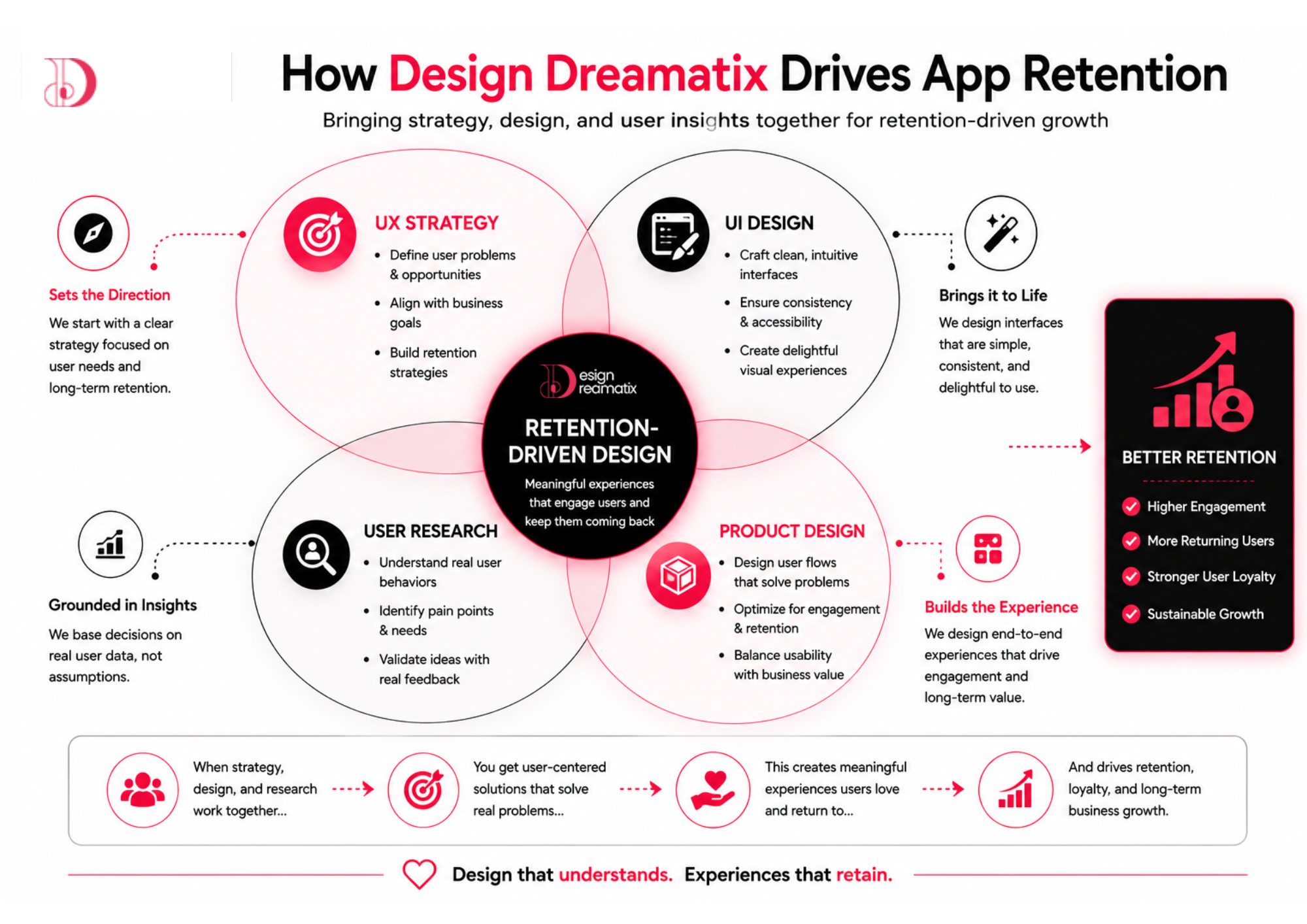
The process outlined above isn’t theoretical, it’s how we approach every mobile and product design engagement at Design Dreamatix. Retention-driven UX rarely comes from a single discipline working in isolation. It comes from UX strategy, UI design, mobile product design, and user research operating as one connected process, rather than separate handoffs between teams.
Our App UI/UX Design work starts with the research and journey mapping steps described above, because a beautifully designed screen built on the wrong assumptions still fails to retain users. For SaaS founders specifically, our SaaS Product Design practice focuses heavily on onboarding and information architecture, the two areas where software products most often lose new users before they ever reach real value.
Where a mobile product connects to a broader digital presence, our Website Design & Development and Landing Page Design services extend the same UX principles into the channels that drive app installs in the first place ensuring the experience feels consistent from the first ad click through to daily in-app use. And because visual identity shapes trust before a single interaction happens, our Brand Identity Design and UI/UX Design work ensures a product’s look and feel reflect the same quality as the experience underneath it.
Prototyping and structured user testing sit at the centre of every engagement, because validated design decisions, not internal opinions, are what actually move retention numbers. The goal in every project is the same: build a product people don’t just download, but genuinely keep choosing to open.
Conclusion
The businesses that win in mobile aren’t necessarily the ones with the biggest marketing budgets they’re the ones whose products people actually want to keep using. Downloads get someone through the door. UX is what determines whether they stay.
Every issue covered here confusing onboarding, inconsistent interfaces, unnecessary friction, ignored accessibility traces back to the same root cause: treating UX as decoration rather than strategy. The ten-step process outlined above exists precisely because retention isn’t the result of one good screen. It’s the compounding effect of research, structure, design, and continuous refinement, all working toward the same goal.
A great mobile app UX was never really about making something look beautiful. It’s about building an experience users trust enough to return to, again and again and that trust is what turns an install into a customer, and a customer into sustainable business growth.
If your app is struggling with retention, or you’re building a new product and want to get the experience right from day one, Design Dreamatix is happy to talk through where the friction might be and what a strategic UX process could look like for your product.
Frequently Asked Questions
Some pre questions and answers
Why is UX important for mobile apps?
UX determines whether users can find value quickly and want to return. Even a strong product idea underperforms if the experience creates friction, confusion, or frustration during everyday use.
What is the difference between UI and UX?
UX (user experience) covers the overall structure, flow, and logic of how a product works for users. UI (user interface) is the visual layer colors, typography, and components that presents that experience. Strong UI supports UX; it doesn't replace it.
How does UX improve user retention?
Good UX removes friction at every stage of the user journey onboarding, navigation, core tasks so users reach value faster and encounter fewer reasons to leave. Retention is, in large part, a direct measure of how well UX is working.
What causes users to abandon mobile apps?
The most common causes include complicated onboarding, confusing navigation, slow performance, inconsistent interfaces, and user flows that require too much effort to complete simple tasks.
What is user journey mapping?
User journey mapping is the process of visualising every touchpoint a user has with a product, from initial discovery through ongoing use, in order to identify friction points and opportunities to improve the overall experience.
How often should app UX be updated?
Rather than following a fixed schedule, UX should be reviewed continuously through analytics, user feedback, and behavioral data with meaningful updates made whenever data reveals a clear opportunity to reduce friction or improve engagement.
How long does a UX design process take?
Timelines vary by scope, but a thorough UX process from discovery through prototyping and testing for a mobile app typically takes 8–14 weeks before development begins in earnest.
Why is onboarding important?
Onboarding is often a user's first real interaction with a product's value. A confusing or lengthy onboarding process is one of the most common points where potential long-term users are lost permanently.
Should startups invest in UX from the beginning?
Yes. UX decisions made early are far cheaper to get right than redesigns made after launch, and a strong first-use experience directly affects whether early users stick around long enough to validate the product at all.
How do you measure UX success?
Common indicators include retention rate, activation rate, task completion rate, time-to-value, app store ratings, and qualitative feedback gathered through usability testing and user interviews.