Case Study
Solving Herbera’s Herbal Brand Differentiation with a Scalable Identity System
Project Info -
Category:
Brand Identity Design, Logo Design
Industry
Healthcare, E-Commerce
Project Overview
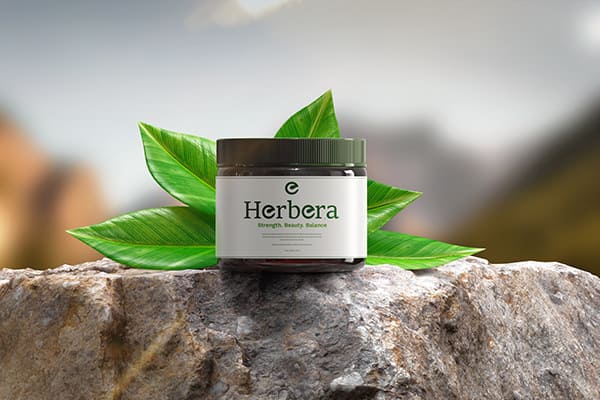
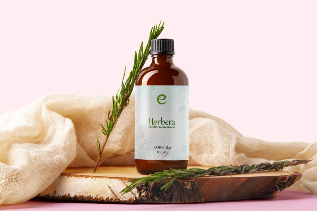
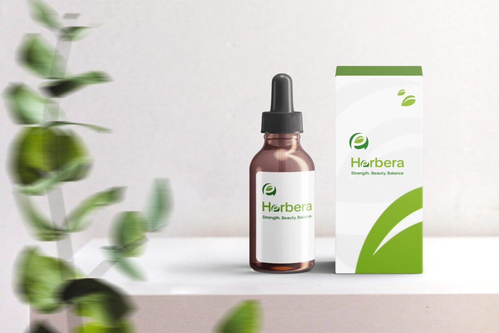
Herbera is a premium herbal wellness brand focused on natural healing, balance, and holistic lifestyle products. As the brand prepared to scale in a highly saturated wellness market, it required a strong, unified identity system capable of positioning it as a premium player rather than a generic herbal product brand.
Dreamatix was engaged to design a complete brand identity system that could unify visual storytelling, elevate perceived value, and ensure scalability across packaging, digital platforms, and future product expansions.
Problem
Herbera was operating in an extremely crowded herbal market where most brands rely on repetitive visual clichés such as leaf icons, floral graphics, and generic green palettes.
The core challenges included
- Lack of differentiation in a saturated wellness category
- Difficulty expressing Strength, Beauty, and Balance without visual clutter
- No unified system for packaging, digital presence, and premium retail positioning
- Limited adaptability across light, dark, and luxury-oriented brand environments
As a result, Herbera risked being perceived as a standard herbal product line rather than a premium wellness brand.
Solution
Dreamatix developed a scalable organic identity system that directly solved each positioning and visual challenge through strategic design decisions.
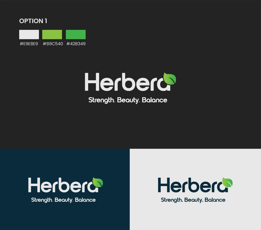
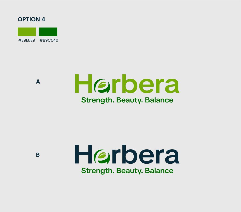
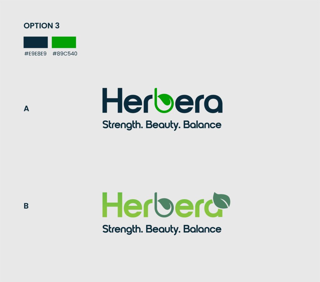
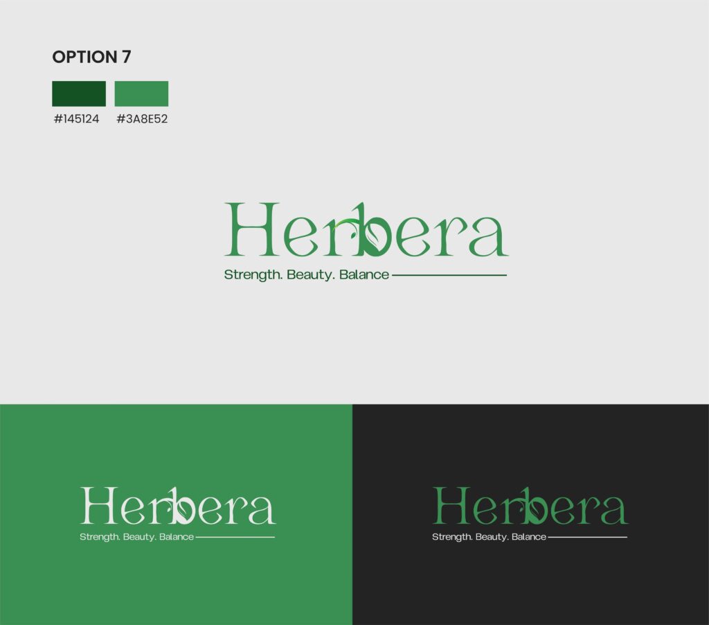
1. Organic Typography as Brand Identity Core
We eliminated cliché botanical graphics and instead embedded natural expression directly into the custom Herbera script logotype.
- Subtle vine-like flow integrated into letterforms
- Organic feel achieved without external icons or illustrations
- A timeless identity that feels natural yet premium
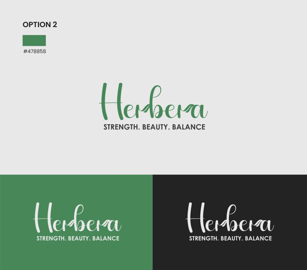
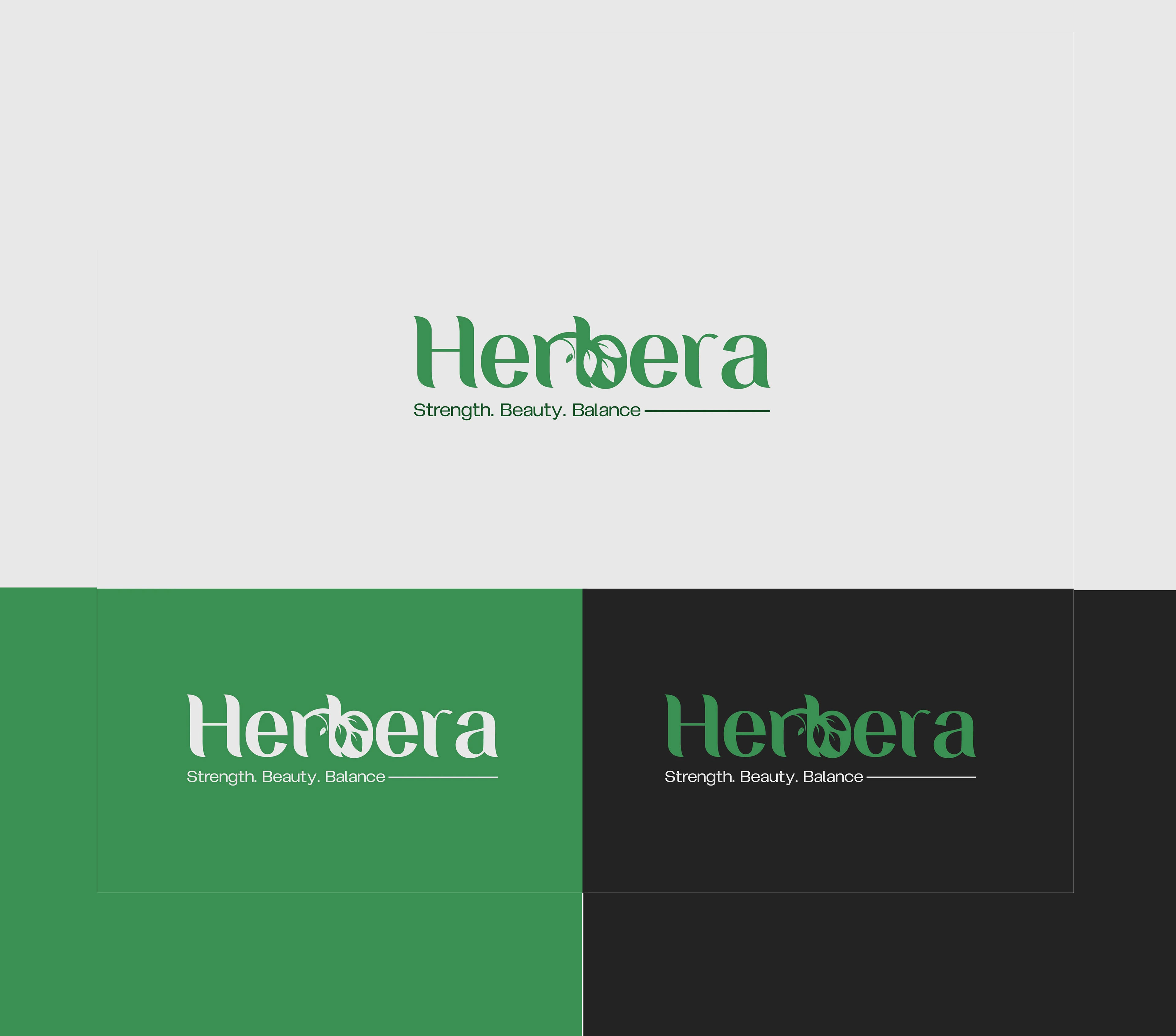
2. Dual-System Brand Structure (Emotion + Authority)
We paired fluid script typography with a structured uppercase sans-serif tagline:
STRENGTH. BEAUTY. BALANCE.
This created a controlled contrast system:
- Script = natural beauty and emotional warmth
- Sans-serif = strength, trust, and clinical clarity
This solved the challenge of expressing multiple brand values without visual chaos.
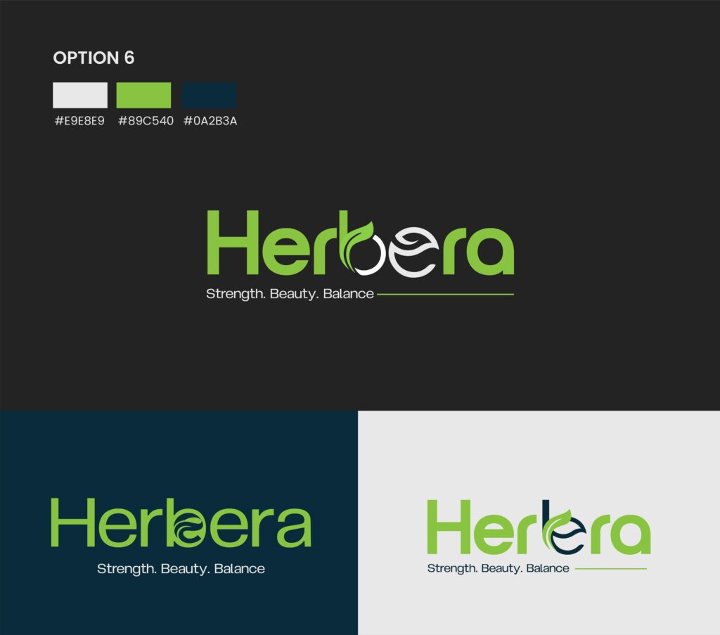
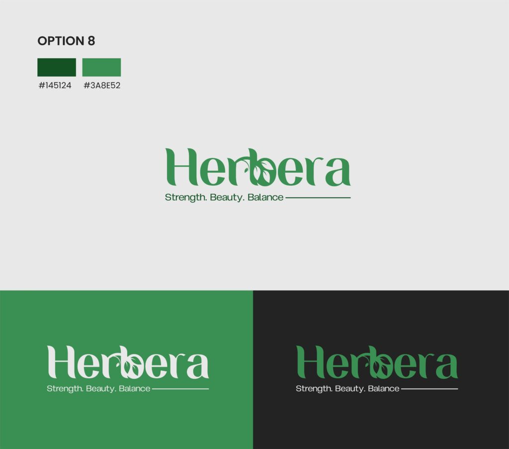
3. Scalable Color & Environment System
We defined Herbera Green (#478858) as the primary emotional anchor, then engineered a flexible environment system:
- Light background → purity & clinical trust
- Green background → natural immersion & brand ownership
- Dark background → premium luxury positioning
This ensured the brand performs consistently across packaging, retail, and digital platforms.
Results & Outcomes
The final identity system repositioned Herbera from a generic herbal label into a premium, structured wellness brand with strong market clarity.
Key outcomes included
- Clear differentiation in a saturated herbal marketplace
- Stronger premium perception through refined typography and structure
- Fully scalable identity system ready for product expansion (skincare, supplements, teas)
- Consistent brand expression across all digital and physical environments
Final Impact: Herbera now operates with a cohesive brand system that communicates trust, wellness, and premium quality positioning it for long-term category leadership.